In 2001, 14 journal artists joined forces in a round-robin journal swap. With a simple theme- COLOR- each artist "hosted" a journal based on a single color scheme. All the artists needed to do was choose a color scheme, create a journal with enough space for the other 13 artists to work in, decorate the front cover and the first couple of pages to get things rolling, and mail it to the next artist on the list. The game was afoot!
Red, Black, White, Blue and Ochre, Aqua, Sepia, Violet and Yellow, Hot Pink and Orange, Sunset, Forest Floor, Metallic... from the get-go, one could tell this was going to be an interesting collaboration.
Every two weeks, artist's completed their contribution and mailed off one journal while anxiously awaiting for the next one to arrive. All mediums were fair game, all interpretations of the color were fair game, all approaches to creating these journals... fair game. It was an opportunity for each artist to show their true colors.
Over the next 16 months, the artists reveled in the journals they received. Some describe ripping open the packages containing their next journal before the postman even left their front walk. Others tell that they would dangle it like a carrot before themselves in order to accomplish some pressing administrative or household task. Still others just wanted to be alone with the newest journal, savoring it with a glass of wine or coffee, curling up with it by the fire to explore every detail of the previous artists' work.
They asked questions like:
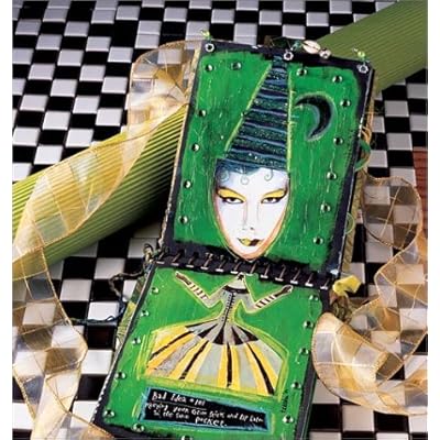
How did the previous journal artists interpret "green"? How can I spring board from that idea or offer a counterpoint to it?
What medium lends itself to the boldness of violet? The subtlety of sepia?
How can I incorporate this piece of chicken wire (or roller skate wheel, or old apron tie) into my house design for "white"?
With each journal received, the artists had the challenge to weigh their independent creative vision against that of the entire group. They had to get a feel for the mingling of ideas and concepts within each journal's pages, while still maintaining their personal sense of style. Some artists chose to stick with their favorite media, others felt the need to branch out and try something new.
Karen Michel says, "Each journal truly emanated the spirit and style of the artist who made it, and at first it was quite a challenge to hold strong to my own vision and what I conceived to be my personal style. Working with the spirit of collaboration, I eased myself into the mingling of visions and images, getting my feet wet at first, then diving right into what turned out to be a very animated conversation of colors. I would listen closely to hear and feel what the book was saying to me and do my best as an interpreter."
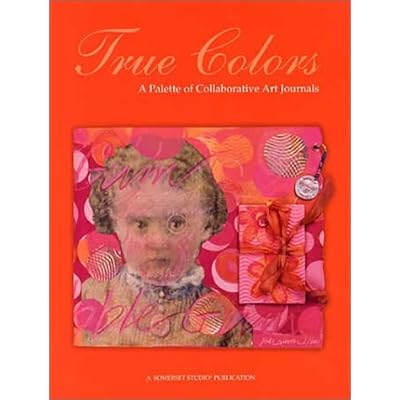
The community that developed through their art journaling experiment continues on. In 2003, Somerset Studio published the collective works of this art journal community in the book,
True Colors: A Palette of Collaborative Art Journals. It is a feast for the eyes, and a vanguard for the altered book and journal industry. Many of the 14 artists have websites featuring their work, as well as tips and ideas for creating altered art.
 Michelle Ward, Nina Bagley
,
Lynne Perella,
Anne Bagby,
Keely Barham,
Sarah Fishburn,
Claudine Helmuth,
Teesha Moore,
Karen Michel,
Marylinn Kelly,
Lisa Renner,
Judi RieschCheck out the book.
Check out the artist's sites.
Get inspired.
 Yesterday my family and I spent the day at George Washington's estate, Mt. Vernon. My husband took this shot facing the Potomac from the mansion. Even though the fall colors were "past peak," they far outdid what the trees in our home state of Texas do this time of year. And I couldn't stop saying, "Look at the colors! How beautiful!"


 Posts
Posts